


Design isn’t only what you see, it’s what you feel the moment you walk in. With my background in psychology, I use color to shape mood, behavior, and connection. That matters at home, and it’s mission-critical for short-term rentals where first impressions drive clicks, bookings, and ⭐⭐⭐⭐⭐ reviews.
Why Color Psychology Matters (Homes & Short-Term Rentals)
Color influences arousal, focus, and social behavior. Your palette isn’t just “style”—it’s the emotional backdrop that helps people decompress, connect, and sleep well. In Short Term Rentals (STRs: Airbnb/VRBO), intentional color translates into stand-out listings, better reviews, repeat guests, and stronger ROI.
Palettes That Perform
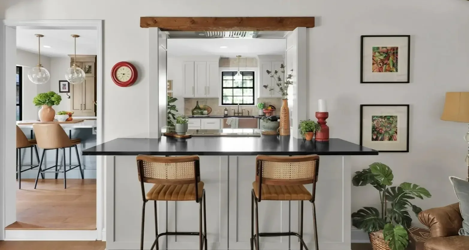
Warm Neutrals → Comfort & Belonging
Creams, warm grays, and sand tones create instant ease—ideal for living and dining zones and for rentals that need “home away from home” energy.
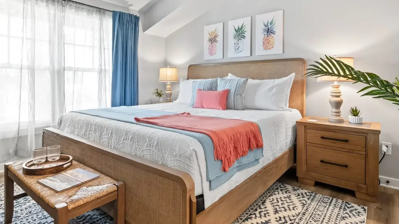
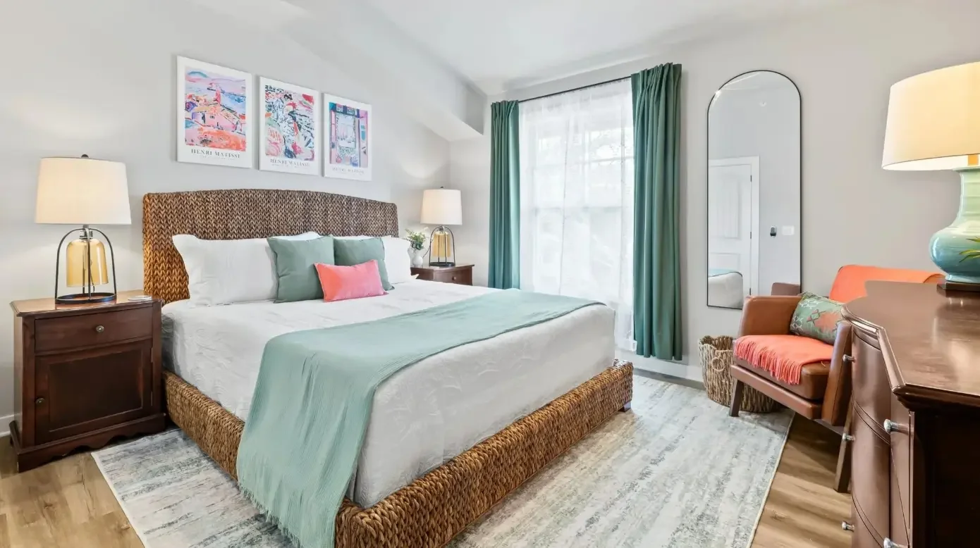
Blues → Calm & Rest
Muted blues in bedrooms and baths support relaxation and better sleep, key drivers of guest satisfaction.
Greens → Restoration & Balance
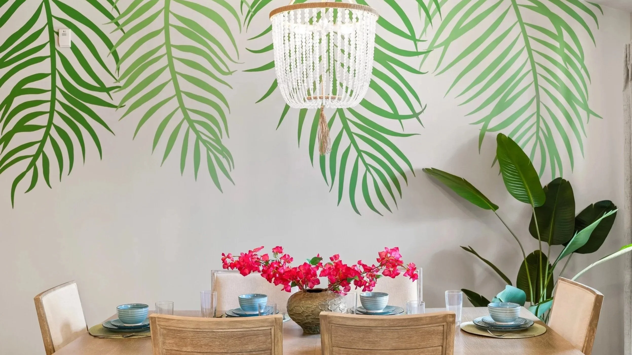
Sage and eucalyptus greens add freshness without shouting. Beautiful in living rooms and entries for a welcoming first read.
Soft Blacks/Charcoal → Grounded Sophistication
Matte black or charcoal accents (hardware, mirrors, frames) anchor airy palettes with quiet luxury.
Accent Moments → Personality (and Photos)
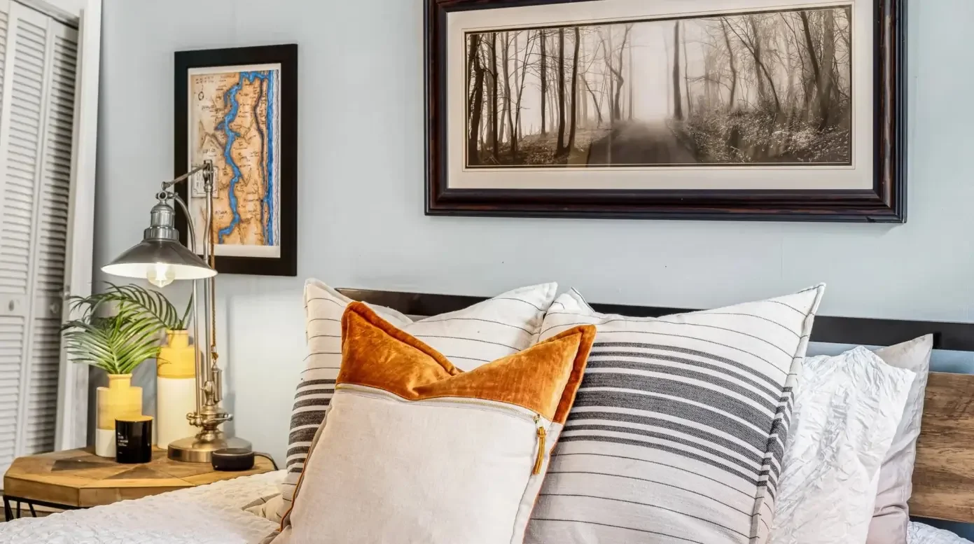
Coral, ink navy, or emerald in small doses, art, a headboard wall, or a coffee-bar backsplash, deliver that “stop-the-scroll” moment without overwhelming the plan.
Fun Room-by-Room Tips For STRs
Entry/Hall: warm-neutral envelope; darker runner, clear circulation for luggage.
Living Room: complex neutral walls, textured rug, green/blue accents; dimmable layered lighting.
Kitchen/Coffee Zone: mostly neutral; one color/pattern moment (backsplash niche or cabinet interior).
Bedrooms: soft blue/green walls, low-contrast bedding; black/bronze hardware for definition.
Baths: stone-inspired neutrals + one saturated note (navy vanity or ink tile band).
Outdoor: sun-tolerant neutrals with one repeated accent color (pillows, planters, throw).
My Approach (Personalized For ROI)
Every project, local or virtual, starts with your goals. We look at how you want the space to feel, how it’s used, the way light behaves, and (for rentals) what will move the needle in your market: click-through rate on listing photos, guest satisfaction, repeat stays, and the ability to raise your ADR (average daily rate) without hurting occupancy. The result is a custom color strategy that feels authentic to your property and supports measurable performance.
The Guest Experience = Your ROI
In vacation rentals, intentional color:
Increases bookings by standing out on Airbnb/VRBO.
Improves reviews via comfort, clarity, and better sleep.
Drives repeat stays by creating a memorable, cohesive experience.
Work With Me From Anywhere:
Virtual Color Consultations & Design Development
If you’re a busy homeowner or vacation-rental owner, we’ll collaborate virtually to build a bespoke color and/or design plan tailored to your architecture, light, materials, and goals. No templates, no generic palettes—just a personalized roadmap designed to elevate guest experience and maximize return on investment.
Next step: Book a complimentary Discovery Call to confirm fit.
(Local clients in NE Florida—St. Johns, St. Augustine, Ponte Vedra, Jacksonville can opt for in-person. Virtual delivers the same clarity on your timeline.)
Designer Tip
When you introduce a bold pattern or saturated accent, let it lead. Pair it with solid, tactile textiles (linen, cotton-slub, performance velvet) so the room reads layered, not loud—in person and in photos.
FAQs
What are the best paint colors for an Airbnb bedroom?
Soft blue or green with white or warm-neutral bedding and low contrast for a calm, high-quality sleep experience.
How do I choose a color palette for a vacation rental?
Start with a warm neutral base, add one dark anchor (charcoal/black), then repeat a single accent family in small doses. Always test under your actual lighting.
Do dark colors hurt booking photos?
Used strategically, deep accents add depth and help thumbnails pop. Keep surrounding surfaces light so the listing reads clearly.
Can this be done virtually?
Yes—my virtual process is personalized, focused on your goals and market, and designed to improve guest experience and ROI.